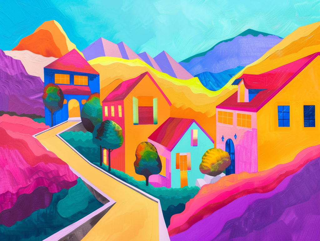
After covering the basics of color theory, let’s dive deeper into the nuances of complementary, analogous, and triadic color schemes. By exploring historical artworks and modern design case studies, we can better understand how these color relationships work in practice and apply them to create visually stunning projects.
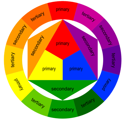
1. Complementary Colors: A Tale of High Contrast

Modern Case Study: In graphic design, complementary colors are often used to create a stand-out call to action. For instance, a bright orange “Buy Now” button on a deep blue background not only catches the eye but also compels action. This approach is effective in digital marketing materials, where capturing attention quickly is crucial.
Theory in Practice: When using complementary colors, balance is key. Too much contrast can be jarring, so it’s important to use one color predominantly and the other for accents. This technique ensures visual interest without overwhelming the viewer.
Historical Artwork: Vincent van Gogh’s “Starry Night” exemplifies the power of complementary colors. Van Gogh used vibrant yellows against deep blues to create a night sky that pulses with energy and emotion. This high-contrast color scheme draws the viewer’s eye and emphasizes the swirling, dynamic sky.
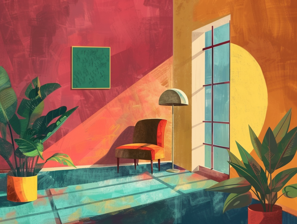
2. Analogous Colors: Harmony and Unity
Modern Case Study: In branding, analogous color schemes can create a cohesive and harmonious look. For example, Starbucks uses shades of green and earthy browns to evoke nature, freshness, and sustainability. This seamless transition between colors fosters a calm and inviting atmosphere.
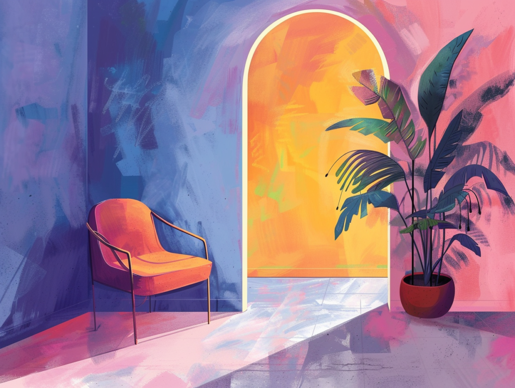
Theory in Practice: Analogous colors work well for creating depth and interest within a limited palette. To avoid monotony, incorporate varying shades and tints, and use a mix of warm and cool tones within your chosen range to add dimension.
Historical Artwork: Claude Monet’s “Impression, Sunrise” uses analogous colors to create a serene and cohesive scene. The blend of oranges, reds, and yellows captures the gentle warmth of a sunrise, with subtle distinctions that guide the eye smoothly across the painting.
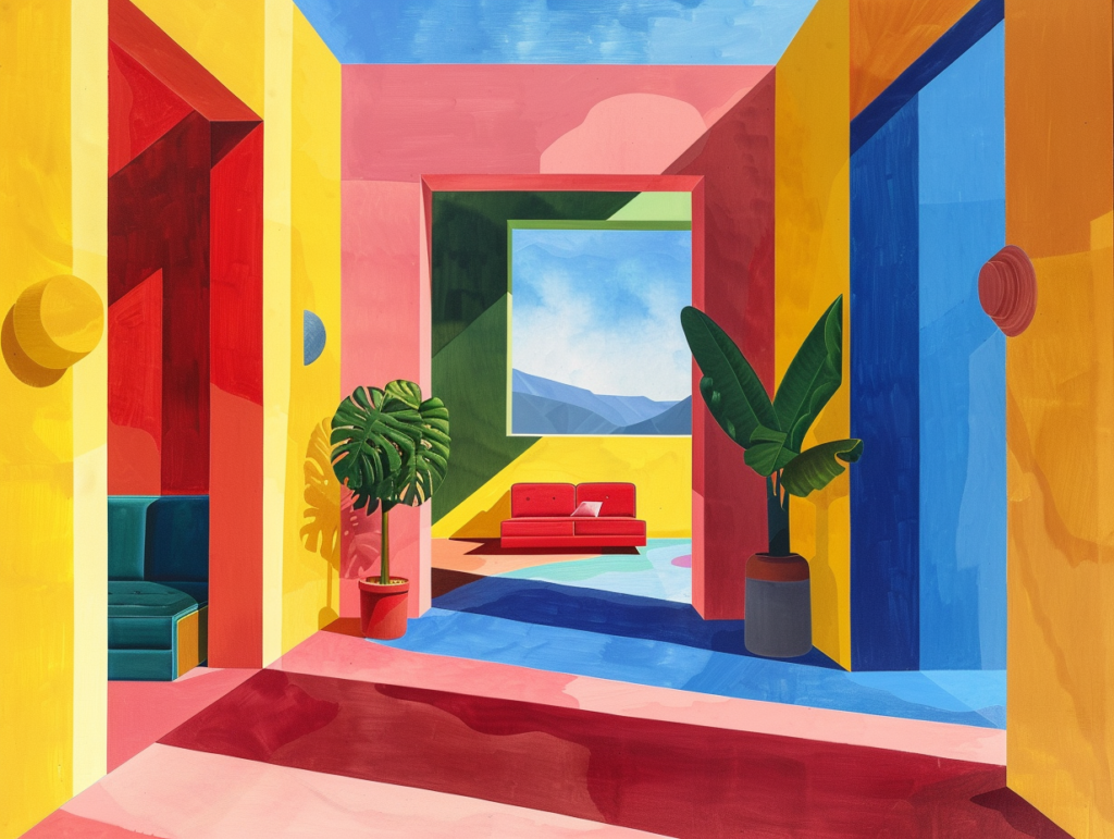
3. Triadic Colors: Vibrant and Balanced
Modern Case Study: The Google logo is a prime example of triadic color use in corporate branding. The use of blue, red, yellow, and green (a near triadic scheme with an extra color) makes the logo eye-catching and playful, which helps to convey a sense of accessibility and innovation.
Theory in Practice: Triadic colors are great for creating a dynamic and engaging aesthetic. To successfully implement this scheme, choose one color to dominate, another to support, and the third as an accent. This hierarchy prevents the colors from competing for attention and creates a more harmonious look.
Historical Artwork: Piet Mondrian’s “Composition with Red, Blue, and Yellow” showcases the triadic color scheme with bold, primary colors balanced against each other in a composition that is both vibrant and harmonious. Each color maintains its own space yet contributes to a unified whole.
Bringing Color Theory into Today’s Design
Understanding and applying these advanced color schemes allows modern creatives to leverage color’s emotional and psychological impacts. Whether designing a new brand identity, creating a piece of street art, or crafting a user interface, color can be your most powerful tool. Remember, while the guidelines of color theory provide a great starting point, creativity often thrives on experimentation. Test different combinations, adjust saturations and brightness, and always keep the viewer’s experience in mind. Dive into your color palette with confidence and let your designs shine with intention and style!