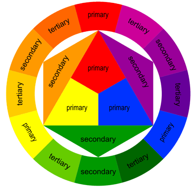
In the world of art and design, the interplay between different elements can transform a simple piece into something truly captivating. One such dynamic element is the Contrast of Extension, also known as the contrast of proportion. This principle, part of Johannes Itten’s seminal seven color contrasts, revolves around the strategic use of color quantities to create visual harmony and focus. This blog post delves deep into the Contrast of Extension, exploring its definition, impact, and practical applications across various creative fields.
Understanding the Contrast of Extension
Definition: The Contrast of Extension concerns the relative quantities or proportions of colors used within a composition. It examines how even small amounts of a vibrant color can balance larger expanses of more subdued, neutral tones, thereby guiding the viewer’s attention and influencing the composition’s overall balance.
Principle: At its core, this contrast is about equilibrium and focus. Colors do not exist in isolation; they interact visually based on their extents and intensities. A dominant color balanced by a smaller area of a complementary color can create a point of interest or serve as a visual anchor in the design.
Significance in Visual Arts
In visual arts, the Contrast of Extension is fundamental for achieving a balanced composition. Artists manipulate the proportion of colors to direct the viewer’s gaze and to emphasize certain elements over others. This contrast is not merely about aesthetic appeal but also about storytelling through color.
Applications in Painting: In painting, an artist might use a large canvas area painted in muted tones with only a splash of bright color to highlight the focal point, such as a bright red apple in a subdued still life. This method draws the viewer’s eye directly to the key subject of the piece.
Applications in Floral Design: Floral designers use the Contrast of Extension to create arrangements where colors are distributed in a way that enhances the overall aesthetic. A common technique is to use abundant greenery with sparse, vibrant flowers to make the colors pop against the neutral background.
Impact in Graphic and Interior Design
Graphic Design: In graphic design, the Contrast of Extension is used to create visual hierarchy and to guide the viewer’s attention across a page. For instance, a designer might use a large background in a soft color with a small, vividly colored call-to-action button to draw attention and prompt interaction.
Interior Design: Interior designers apply this contrast to balance spaces effectively. A room might be designed with neutral walls and a bold-colored piece of furniture or art to serve as the room’s centerpiece, creating a dynamic yet harmonious space.
Tips for Using the Contrast of Extension Effectively
- Start with a Base Color: Begin your design with a dominant, usually neutral color that will serve as the foundation of your palette.
- Choose Your Accent Colors: Select a smaller proportion of accent colors to create points of interest. These should be more vibrant or significantly darker or lighter than your base color to stand out effectively.
- Experiment with Proportions: The traditional rule is to use the 60-30-10 rule, where 60% is your dominant color, 30% your secondary color, and 10% your accent color. Adjust these proportions based on the desired impact and focus of your composition.
- Balance Through Placement: Consider not just the proportion but the placement of your colors. Even a small amount of a vibrant color can have a large impact if strategically placed.
Conclusion
The Contrast of Extension is a powerful tool in the arsenal of any designer or artist. By adjusting the proportions and relative intensities of colors within a composition, one can dramatically influence the focus, mood, and effectiveness of a design. Whether crafting a new brand logo, decorating a home, or creating a masterpiece on canvas, understanding and applying the principles of the Contrast of Extension can lead to more dynamic, balanced, and engaging visual creations.