Johannes Itten, a foundational figure at the Bauhaus, deeply influenced the way we understand and apply color in design and art today. His theory of the seven color contrasts is particularly revolutionary, providing artists and designers with a structured approach to exploring the dynamics of color. Today, we’ll discuss each of the seven contrasts, explaining their principles and how they can be effectively used in various creative disciplines.
1. Contrast of Hue
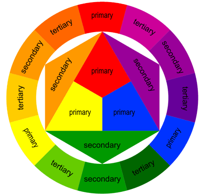
The contrast of hue is the most basic form of color contrast, involving the use of pure colors from the color wheel. It is simply the contrast that exists between the more distinct colors, which are seen when hues are at their full saturation. This contrast is vivid and highly effective at catching the viewer’s eye, making it ideal for pieces that aim to be energetic and captivating.
Applications: This type of contrast can be used in advertising to grab attention or in fine art to create vibrant, dynamic compositions.
2. Light-Dark Contrast
This contrast involves the use of lightness and darkness of colors, not merely black and white. By adjusting the value of colors, artists can create depth, emphasize forms, and guide the viewer’s focus. It’s a fundamental contrast in creating the illusion of three-dimensionality through shading and tonal work.
Applications: In graphic design, light-dark contrast can be used to create a visual hierarchy in layouts. In photography, it can enhance the emotional quality of black and white images.
3. Cold-Warm Contrast
Colors are also associated with temperature, with blues and greens perceived as cool and reds and yellows as warm. The cold-warm contrast can evoke different feelings and atmospheres; warm colors often appear closer to the viewer while cool colors recede, affecting the spatial perceptions in compositions.
Applications: Interior designers use this contrast to create mood in a room—warm colors for a cozy, inviting space and cool colors for calm, relaxed areas.
4. Complementary Contrast
Complementary colors are directly opposite each other on the color wheel, such as red and green or blue and orange. This contrast is highly effective for making each color appear more vivid and is often used to create a sense of balance and vibrancy.
Applications: This contrast is popular in branding to create striking logos and in art to guide the viewer’s eye to focal points.
5. Simultaneous Contrast
Simultaneous contrast is the effect colors have on each other; it refers to the manner in which two different colors affect each other’s appearance. For example, a grey tone will appear slightly bluish when placed next to a yellow area because of the contrasting color temperatures.
Applications: This contrast can be utilized in color grading in film to enhance atmospheric depth or in web design to ensure that text stands out against background colors.
6. Saturation Contrast
Saturation contrast involves pairing saturated colors with desaturated ones. This contrast can help in creating a focus on certain elements and is less jarring than using high contrasts of hue or value.
Applications: In fashion design, designers might combine vibrant colors with muted tones to create outfits that are both balanced and bold.
7. Contrast of Extension (Proportion)
Also known as the contrast of proportion, this involves the relative quantities of colors used in composition. A small amount of a vibrant color can balance out a larger expanse of a neutral tone, for example.
Applications: This type of contrast is essential in painting and floral design, where the proportion of colors can determine the focal points and overall balance of the arrangement.
Conclusion
Understanding and applying Johannes Itten’s seven color contrasts can significantly enhance the effectiveness of visual projects by adding depth, emotion, and emphasis. Whether you’re a graphic designer, a painter, an interior decorator, or any kind of visual artist, mastering these contrasts allows for more expressive and impactful creations. Itten’s legacy in color theory not only provides a technical foundation for working with colors but also inspires creativity and experimentation in all forms of visual communication.