Color theory is a cornerstone of design, influencing how visuals are perceived and how messages are communicated. Among the various color schemes designers employ, split-complementary colors offer a dynamic balance, providing harmony and contrast in a visually appealing and strikingly effective way. This blog post explores the split-complementary color scheme, its characteristics, applications, and how it can be leveraged to create engaging and balanced designs.
Understanding Split-Complementary Colors
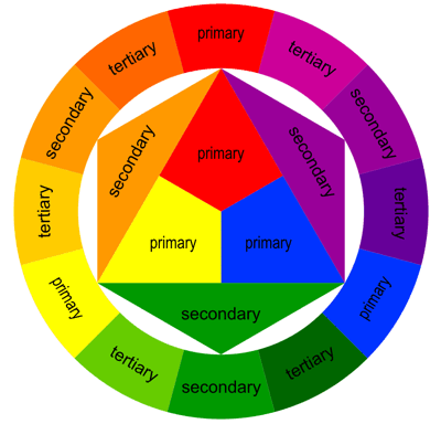
Definition and Basics: The split-complementary color scheme is a variation of the standard complementary color scheme. In a traditional complementary scheme, colors lie directly opposite each other on the color wheel, such as red and green. The split-complementary scheme, however, takes one base color and uses the two colors adjacent to its complement. This creates a color palette with less tension than the standard complementary scheme, resulting in more visual comfort while retaining strong visual contrast.

Characteristics: A split-complementary color scheme offers a rich contrast but is less aggressive than a direct complementary scheme. It provides more nuanced options for color choices, making it versatile and easier to balance. For instance, if you choose blue as the base color, instead of using just orange (its direct complement), you would use the colors on either side of orange, such as red-orange and yellow-orange.
Advantages in Design

Balanced Visual Appeal: This color scheme is particularly appreciated for its vibrant yet balanced aesthetic. It allows for a pleasing contrast that is vivid but not jarring, making it suitable for a wide range of applications—from digital design to interior decorating.
Flexibility and Harmony: Split-complementary colors offer more variety than simple complementary schemes, providing more opportunities to create a harmonious design that still catches the eye. This flexibility makes it a favorite choice for designers who want to experiment with color without the risk of clashing hues.
Practical Applications of Split-Complementary Colors
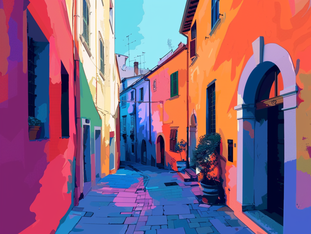
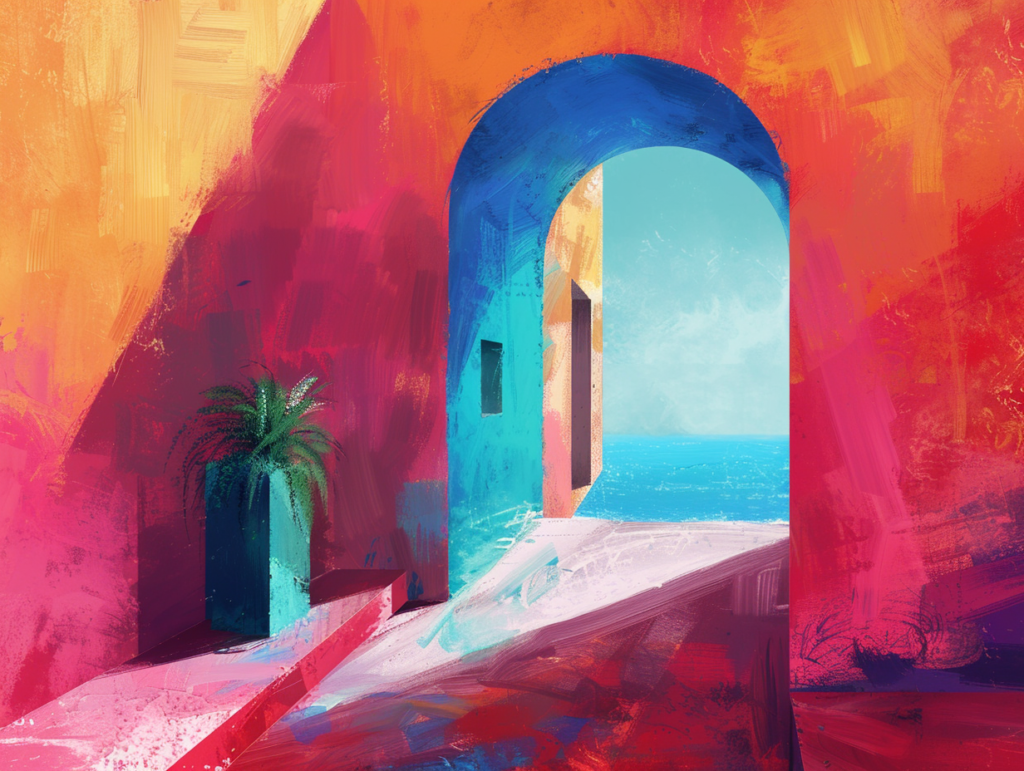
Graphic and Web Design: In digital layouts, using a split-complementary scheme can help create websites that are dynamic and engaging. For example, a site using a blue background might feature call-to-action buttons in red-orange and content highlights in yellow-orange, creating a cohesive yet energetic interface.
Interior Design: This color scheme is often used in home decor to create a lively yet balanced environment. A living room with navy blue walls might include coral red cushions and golden-yellow decorations to invoke warmth and vibrancy without overwhelming the senses.
Fashion Design: In fashion, a split-complementary color palette can help create outfits that are bold and stylish. A dress in a cool mint shade could be paired with accessories in warm coral and peach tones for a look that is both eye-catching and elegant.
Advertising and Branding: Brands often use split-complementary colors to design logos and advertisements that stand out while maintaining aesthetic harmony. This scheme can help a brand logo or ad pop out in crowded visual spaces like billboards or social media feeds.
Tips for Using Split-Complementary Colors Effectively

- Choose a Dominant Color: Start with one dominant color and use the other two for accents. This prevents visual confusion and keeps the focus clear.
- Pay Attention to Proportions: Balance your colors by using them in varying proportions. A common approach is the 60-30-10 rule, where 60% is your main color, 30% is the secondary color, and 10% is an accent color.
- Consider Context and Mood: Think about the emotional impact of your colors. Each color evokes different feelings and reactions, so choose your palette based not just on aesthetic, but also on the message you want to convey.
Conclusion

Split-complementary colors are a fantastic tool for designers looking to create visually appealing, dynamic, and harmonious designs across various media. By understanding and skillfully applying this color scheme, designers can enhance the visual impact of their creations, ensuring that they not only attract attention but also maintain aesthetic balance and communicate effectively. Whether you