In the visual arts, contrast and emphasis are powerful tools that designers wield to direct attention, convey messages, and create impactful compositions. These principles are fundamental in establishing visual hierarchy and guiding viewer interactions with the content. By understanding and effectively applying contrast and emphasis, designers can enhance the clarity and engagement of their projects. This blog post explores how contrast can create visual interest and establish a hierarchy, and how emphasis can guide viewer attention to convey the main message effectively.
The Power of Contrast
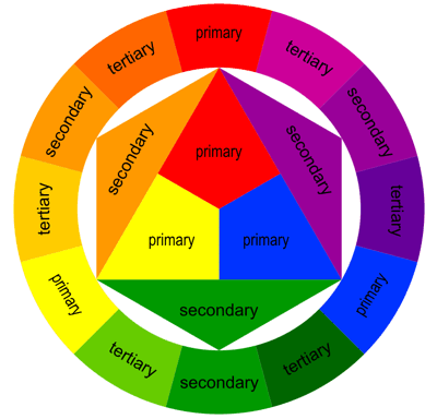
Definition and Importance: Contrast is the difference between elements in a design. It can involve color, size, shape, texture, type, and space. The greater the difference, the more noticeable the contrast. This principle is crucial because it attracts the eye and makes a design more memorable and engaging. Contrast improves readability and usability by clearly distinguishing between elements.
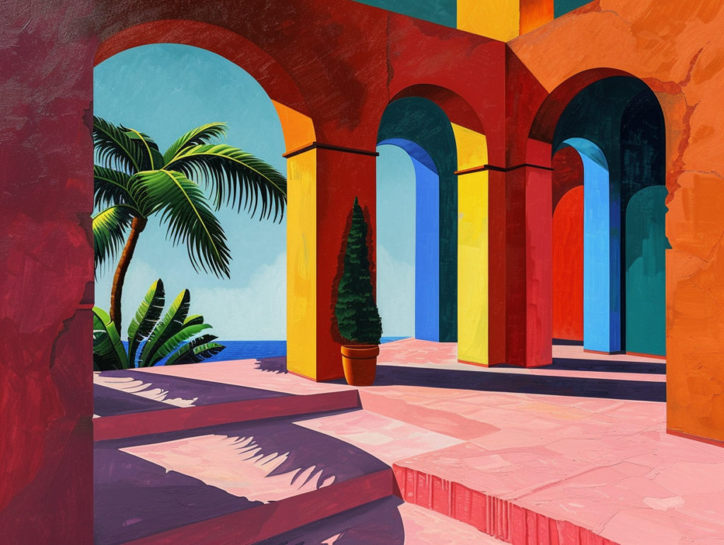
Creating Visual Interest: By varying elements like color intensity, value, and size, designers can create focal points and areas of interest. For instance, a bright, colorful element on a monochromatic background will stand out and attract the eye. This is not only pivotal in art but in marketing materials, websites, and apps where attracting user attention is essential.
Establishing Visual Hierarchy: Contrast organizes information in a way that implies importance. In typography, for instance, contrasting a bold, large font for headlines with a smaller, lighter font for body text helps readers instantly recognize the structure of information. Similarly, in UI design, contrasting buttons with the background can highlight them as interactive elements, guiding user actions.
The Role of Emphasis

Definition and Purpose: Emphasis, sometimes called dominance, involves making a part of the design stand out to draw the viewer’s attention. This principle is used to highlight the most important elements, ensuring they are noticed first and that the viewer’s attention is correctly focused.
Guiding Viewer Attention: Designers can use techniques such as placing an element in the line of natural scanning (left to right, top to bottom in Western cultures), isolating the element, or using leading lines that point toward it. Emphasis is crucial in advertising, where key messages must stand out, or in instructional design, where specific information needs to be highlighted.
Conveying the Main Message: In a crowded design, emphasis helps simplify the message, drawing attention to the core value proposition or call to action. For example, a promotional poster might use a large, vibrant headline to capture attention, with a high-contrast ‘Buy Now’ button as the focal point. This not only ensures the message is seen but also enhances the likelihood of action.
Real-World Applications of Contrast and Emphasis
Advertising: High contrast in color and typography makes billboards and online ads capture attention quickly. The use of bold colors against a subdued background or dynamic typeface sizes ensures that the key message dominates the visual landscape.
Web Design: Websites use contrast and emphasis to enhance user experience and navigability. For instance, Amazon uses contrasting colors to highlight its ‘Add to Cart’ button, ensuring it stands out from other page elements. Emphasis is placed on user reviews and prices to guide purchase decisions.
Branding: Effective branding uses contrast to differentiate itself from competitors and to make the brand identity unmistakable. Apple’s clean, minimalistic design style contrasts sharply with more colorful and busy tech brands, emphasizing its focus on simplicity and user-friendliness.

Conclusion
Contrast and emphasis are indispensable tools in the designer’s toolkit. They enhance the effectiveness of communication by creating visual interest, establishing hierarchy, and ensuring the main message is both seen and remembered. By mastering these principles, designers can create more engaging, functional, and aesthetically pleasing designs that resonate with their audience and achieve desired outcomes, whether in print, digital media, or physical spaces. Understanding and applying contrast and emphasis allow designers to not just present information, but to communicate visually and powerfully.