In the vibrant world of design, the tetradic or double complementary color scheme stands out as a rich and varied approach to using colors. This color strategy involves four colors arranged into two complementary pairs, offering a wide range of possibilities and a dynamic balance that can make any design pop with visual interest. This blog post delves deep into the tetradic color scheme, exploring its definition, how to effectively use it, and its applications in various design fields.
What is a Tetradic Color Scheme?
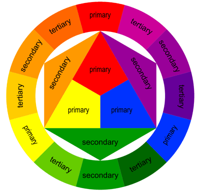
Definition and Structure: The tetradic color scheme, also known as the double complementary scheme, uses four colors together, in the form of two sets of complementary colors. This scheme is considered one of the most complex in color theory, providing a vast array of colors that can create vibrant and engaging visual compositions.

To visualize this, imagine a rectangle on the color wheel. The four corners of this rectangle will touch four colors; these are the colors used in the tetradic scheme. For example, if one pair is red and green, the other might be blue and orange. This combination offers both warm and cool colors, which can be mixed and matched to enhance visual harmony and contrast.
Advantages of Using Tetradic Colors in Design

Rich and Vibrant Visuals: The primary advantage of a tetradic color scheme is its ability to produce rich and vibrant visuals. With four colors to play with, designers can create complex and layered designs that are full of life and energy.
Versatility and Balance: This color scheme allows for considerable flexibility, making it suitable for various uses from graphic design to interior decor. The balance comes from the natural harmony of the complementary colors, which ensure that even with a variety of hues, there is a cohesive visual flow.
Enhanced Creativity: The tetradic scheme encourages creativity, giving designers the chance to experiment with multiple combinations and contrasts within a single design.
Effective Usage of Tetradic Color Schemes
Choosing Your Colors: Begin by selecting a dominant color that will guide the mood of your design. This color will influence your secondary choices, which should complement and enhance the dominant hue. The two complementary pairs should work in harmony to create a balanced look.
Maintain Balance: While the tetradic scheme offers a lot of colors, maintaining balance is crucial. You can achieve this by using one color as the dominant hue and the others as accents. Be mindful of how the colors interact with each other to prevent any one color from overwhelming the composition.
Consider Color Values and Saturation: To avoid visual chaos, play with different tints, tones, and shades of your chosen colors. This variety can add depth and dimension to your designs without sacrificing cohesion.
Applications in Various Fields

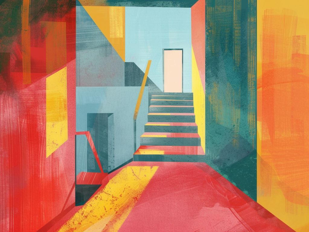
Graphic Design: In promotional materials, the tetradic scheme can make elements stand out and look appealing. For instance, a flyer with a blue and orange background can feature graphics in red and green, drawing the eye and keeping the viewer engaged.
Interior Design: A living room, for example, can feature a deep blue sofa (primary color) against a light orange wall (complementary color), with green cushions and red decorative pieces as accents. This approach can create a lively and inviting space.
Fashion Design: Clothing designers can use tetradic schemes to create vibrant outfits that stand out on the runway. A dress might feature a predominantly violet color with yellow accessories, complemented by touches of green and red.
Web Design: Websites can use tetradic colors for their UI elements to create a visually engaging and user-friendly interface. Navigation elements, buttons, and links can be differentiated using contrasting colors, which also improves usability.
Conclusion

The tetradic (double complementary) color scheme offers a dynamic palette that can transform any design from simple to spectacular. By understanding how to balance and apply these colors, designers can enhance the aesthetic appeal and functionality of their projects across different media. Whether creating digital art, decorating a home, or designing a new clothing line, the tetradic color scheme provides a robust framework for exploring creative and visually stimulating designs.