Design is a multifaceted language of its own, a visual communication that guides the viewer through a crafted experience using fundamental elements like line, shape, color, texture, space, and form. Each of these elements serves as the building blocks of any artistic or graphic composition, and understanding how to manipulate them effectively can transform a simple design into a compelling piece of visual storytelling. Let’s delve into each element and explore their contributions to the overall impact of a design.
Line: The Starting Point of All Structures

A line is the most basic element of design, but its simplicity belies its importance. It connects points and defines shapes, guiding the eye across a page. Lines can be horizontal, vertical, diagonal, curved, or zigzag; each type evokes a different emotion and directs attention differently. Horizontal lines suggest calm and stability, while vertical lines evoke strength and structure. Diagonal lines convey movement, and curved lines often imply elegance and softness. The way lines intersect and interact can create tension or harmony, drive focus, and structure the entire layout of a composition.
Shape: Defining Boundaries
Shapes are created when lines meet to enclose space. They are categorized into geometric (circles, squares, triangles) and organic shapes (irregular, free-form). Geometric shapes contribute to a sense of order and predictability, making them a staple in corporate and structured designs. Organic shapes, with their uneven and often complex edges, bring a natural, dynamic quality to designs, often used to evoke spontaneity and fluidity. Shapes are not merely decorative; they play a critical role in creating mood and meaning in visual projects.
Color: Communicating and Influencing Mood
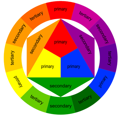
Color is perhaps the most emotive element of design. It can attract attention, set a mood, and even influence psychological responses. Understanding color theory is essential for effective visual communication. The color wheel, color harmony, and the context in which colors are used can dramatically alter the viewer’s perception and emotional response. For instance, blue can feel calming or cold, red can appear aggressive or vibrant, and yellow might be cheerful or straining to the eye, depending on their use and cultural context.
Texture: Adding Depth and Sensation
Texture relates to the surface quality of a design. It can be visual (implied texture) or tactile (physical texture). In graphic design, texture is used to add depth and tactile contrast, bringing a printed piece to life or adding realism to digital work. Textures can evoke different feelings and can make a design more intriguing and engaging by appealing not just to the eye, but to the sense of touch.
Space: The Breathing Room
Space, or negative space, is the area around and between elements in a design. It is not merely background; it is an active part of the design’s structure. Effective use of space can enhance readability, create balance, and help highlight important components within the design. In minimalist art, space is often used to bring forward simplicity and elegance, proving that sometimes less is indeed more.
Form: Bringing Dimensions to Life
Form takes shape to the next level, giving it depth and dimensions. Forms can be either three-dimensional or two-dimensional; they add volume and are enhanced by light and shadow. In graphic design, forms are simulated using gradients, shading, and perspective to give a flat image a more realistic, lifelike quality.
Conclusion
Mastering these fundamental elements allows designers to communicate more effectively through their visual compositions. Each element can stand alone yet often interacts with others, creating a cohesive and engaging narrative. As you design, think of each element as a tool in your visual toolbox—essential, versatile, and powerful in its own right. Whether you’re a budding designer or a seasoned artist, revisiting these basics can help you refine your craft and enhance your visual communication skills, ensuring every piece you create not only communicates but resonates deeply with your audience.


